When new clients approach us, they often raise three key questions about SharePoint:
- Can SharePoint handle specific tasks (X)? Yes, in most cases. However, assessing whether it's the ideal solution for a particular task is another consideration altogether.
- What's the cost involved in enabling X on SharePoint? The expense varies based on the nature of X. Our packaged solutions are often more cost-effective than custom implementations.
- Is X accessible on mobile devices? Let's delve into this topic together!
SharePoint, an enterprise solution accessible through browsers, emerged ahead of its time in the early 2000s. However, it wasn't initially mobile-friendly. Back then, design for mobility wasn't a priority until the advent of Apple's iPod/Pad/Phone revolution.
The Shift to Responsive Design and SharePoint's Response
Fast forward to today, where handheld computing devices are ubiquitous, setting the expectation for everything to be mobile-accessible—a fair demand in this new era.
In recent years, 'responsive design' has become the norm for external websites, ensuring seamless rendering across devices. Although SharePoint lagged in aesthetics initially, it gradually caught up, offering mobile views for lists and libraries. Yet, achieving mobile branding required customizations due to varied screen sizes and default browsers across devices.
SharePoint's Strides Towards Modern Mobile Integration
The introduction of 'device channels' marked SharePoint's first stride towards modern mobile integration. However, configuring these channels for specific devices demanded technical know-how and wasn't the most user-friendly setup.
Evolving User Expectations and Microsoft's Response
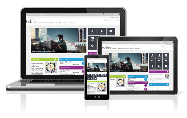
Presently, user expectations have evolved. Today's users anticipate not just responsive websites but also mobile apps tailored to their device functionalities. Microsoft has responded by emphasizing mobility through various avenues like the O365 app, SharePoint app, and PowerApps. SharePoint Online sites, designed 'mobile-first,' dynamically adjust to screen sizes, ensuring a mobile-friendly experience.
Empowering Mobility: Impact and Benefits
This enhanced SharePoint mobility empowers providers to craft functional and aesthetically pleasing sites and apps, benefiting the mobile workforce and boosting productivity.
Looking Ahead: Future Prospects with hubley
Excitingly, on the hubley front, a native app is on the horizon, promising direct access to the intranet for hubley clients via personal devices.
Thank you for exploring SharePoint mobility with us!
© 2023 Rogue Services and Solutions, LLC DBA hubley
All Rights Reserved